
Almost every quality problem you will ever face can be analyzed with at least one of the seven basic quality control tools. These tools form the foundation of process improvement in Lean Six Sigma, and the histogram is where the series begins.
What Is a Histogram?
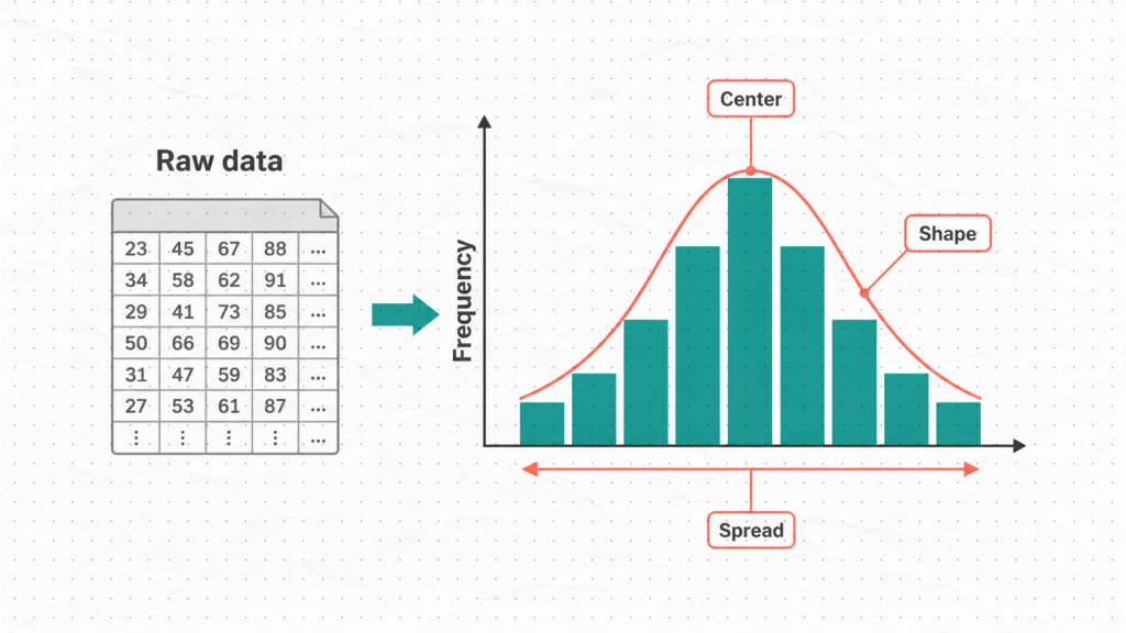
A histogram is a bar chart that shows how often values occur within a dataset. It takes a list of numerical measurements, groups them into ranges called bins, and displays how many data points fall into each range.
The result is a visual picture of your data’s distribution. Instead of staring at rows of numbers in a spreadsheet, you get an immediate answer to three fundamental questions:
- Where is my data centered?
- How spread out is it?
- What shape does it take?
These three questions are at the heart of process understanding, and the histogram answers all three at a glance.
How to Build a Histogram
In practice, software builds the histogram for you in seconds. But understanding the manual steps ensures you know what the tool is actually doing, which makes you a better analyst.
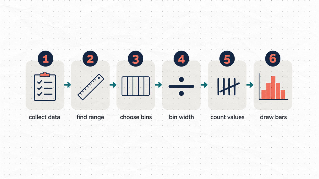
Step 1: Collect your data. You typically want at least 50 data points, and ideally 100 or more, for the shape to be meaningful. Small samples can produce misleading patterns.
Step 2: Find the range. Subtract the smallest value from the largest value. This defines the span your bins must cover.
Step 3: Decide how many bins to use. A common rule of thumb is to take the square root of the number of data points. For 100 measurements, that gives approximately 10 bins.
Step 4: Calculate the bin width. Divide the range by the number of bins. Every bin should be the same width so the chart is not visually distorted.
Step 5: Count values per bin. Tally how many data points fall into each range. This is your frequency count.
Step 6: Draw the bars. The height of each bar represents the frequency for that bin. The bars are adjacent, with no gaps, which distinguishes a histogram from a standard bar chart.
That is the full construction process. Once you understand it, you can let software handle the calculation while you focus on interpreting the result.
How to Read a Histogram: The Shapes That Matter
Building the histogram is the easy part. Reading the shape is where the real analytical value lives. Here are the five patterns you will encounter most often in quality work.
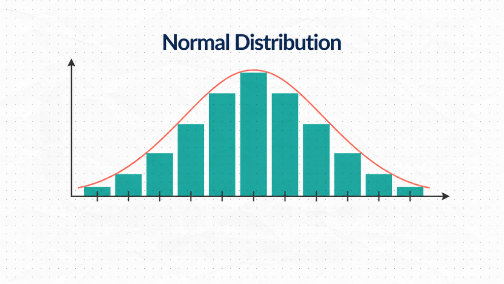
Normal Distribution (Bell Curve)
A symmetric, bell-shaped histogram indicates that most values cluster around the center and taper off evenly on both sides. This is what a stable, predictable process typically looks like. When you see this shape, it is a good sign.
Skewed Distribution
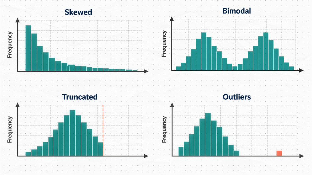
A skewed histogram has a long tail stretching to the left or right. The data is not symmetric around its center. This can be perfectly natural for some process types — for example, cycle time data cannot go below zero, so it often skews right. The key is to understand whether the skew reflects the nature of the process or a real problem.
Bimodal Distribution (Two Peaks)
Two distinct peaks in a histogram are a significant clue. A bimodal shape almost always means you are looking at data from two different sources — two machines, two shifts, two operators, or two raw material lots mixed into a single dataset. The histogram is telling you to stratify your data before drawing any conclusions.
Truncated (Cut-Off) Distribution
When the histogram has an abrupt wall on one side instead of a natural taper, that is often a sign that parts were sorted or inspected before measurement. The defective units were removed, so the histogram only shows you the surviving population. This shape should raise questions about what happened to the missing data.
Isolated Bars (Outliers)
Bars sitting away from the main distribution, separated by gaps, point to outliers or data entry errors. These individual points deserve investigation before any broader conclusions are drawn.
Using Histograms for Process Capability
This is where the histogram transitions from a descriptive tool to a decision-making tool.
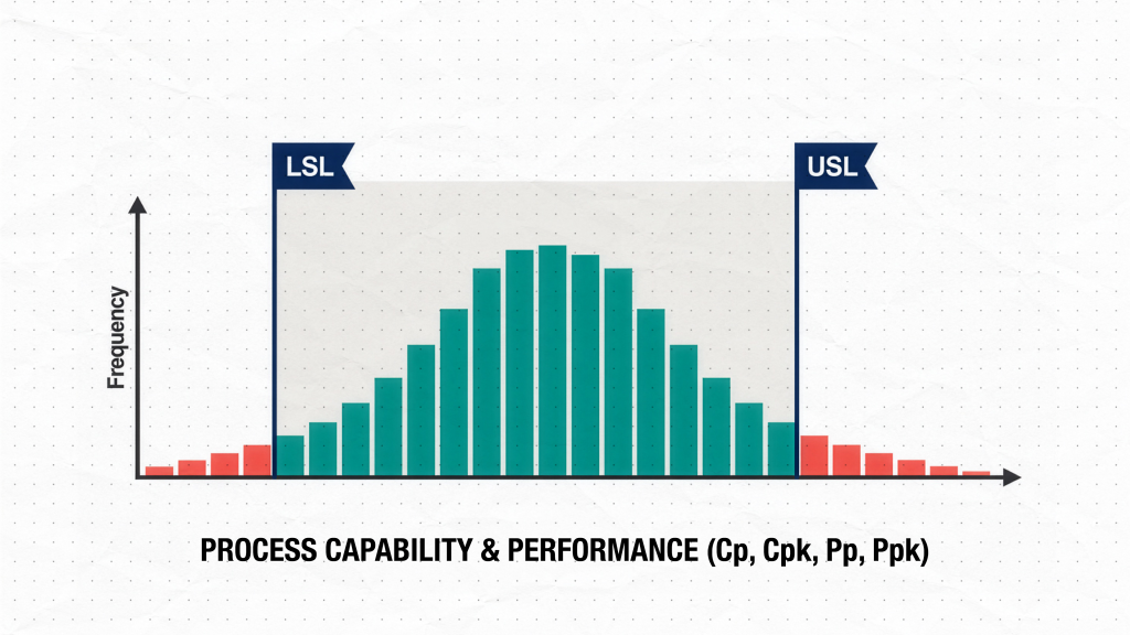
When you overlay your specification limits on the histogram, you can immediately see whether your process is capable of meeting requirements:
- Draw a vertical line at the Lower Specification Limit (LSL) and another at the Upper Specification Limit (USL).
- If the entire histogram sits comfortably between those two lines, your process is producing within specification.
- If bars extend beyond either limit, you are generating defects. The histogram shows you how much and in which direction.
This visual comparison is a fast, intuitive first pass at capability. When you follow it with a formal capability calculation — Cp, Cpk, Pp, or Ppk — you get a precise, quantified answer to go alongside the picture. For a deeper treatment of capability indices, see the Process Capability Analysis guide.
Practical Tips for Better Histograms
Use enough data. A histogram built from 20 or 30 points can mislead you about the true distribution shape. Collect at least 50 data points, and aim for 100 or more when possible.
Be thoughtful about bin count. Too few bins collapse real patterns into a flat, uninformative shape. Too many bins fragment the data into noise that looks like random spikes. The square root rule is a reasonable starting point, but adjust based on what you see.
Never analyze a histogram in isolation. A histogram describes the distribution of your data, but it does not tell you whether your process is stable over time. Use it alongside a control chart to confirm stability before drawing capability conclusions. A capable-looking histogram built from an unstable process is not reliable.
Histogram vs. Other QC Tools
| Tool | What It Answers |
|---|---|
| Histogram | How is my data distributed? |
| Control Chart | Is my process stable over time? |
| Pareto Chart | Which defect categories matter most? |
| Cause-and-Effect Diagram | What are the root causes of variation? |
| Scatter Diagram | Is there a relationship between two variables? |
Build Histograms Instantly in SigmaDesk
If you want to build histograms and run a full process capability analysis without manually setting up bins or typing a single formula, SigmaDesk handles all of it automatically. Upload your data, and the platform generates the histogram, overlays your specification limits, and computes capability indices in one step.
What’s Next in the 7 QC Tools Series
This article is Part 1 of the 7 Basic Quality Control Tools series. The full series covers:
- Histogram ← You are here
- Check Sheet
- Pareto Chart
- Cause-and-Effect (Fishbone) Diagram
- Control Chart
- Scatter Diagram
- Stratification