SIGMADESK – AI Fishbone Diagram Maker
Built for Real Root Cause Analysis
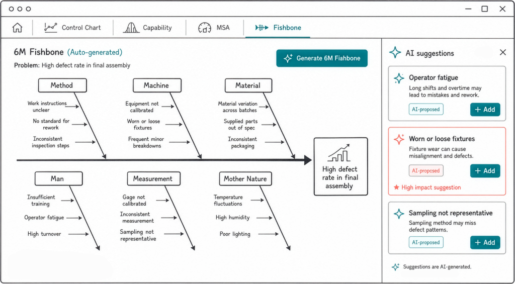
SIGMADESK includes an online Fishbone Diagram generator — also called an Ishikawa diagram or cause-and-effect diagram — that lets you structure, analyze, and act on root cause investigations directly in your browser. It covers the full workflow that quality practitioners use in DMAIC Analyze phases, production quality reviews, and corrective action reports.
Six standard cause categories out of the box:
- People — training gaps, workload, skill level, operator variability, and human factors that contribute to the problem.
- Process — workflow steps, standard operating procedures, sequencing issues, and process controls that may be inadequate or absent.
- Materials — incoming material quality, supplier variation, storage conditions, and component specifications.
- Methods — measurement techniques, inspection criteria, work instructions, and the decision rules used in the process.
- Machine — equipment condition, calibration status, tooling wear, maintenance schedules, and mechanical capability.
- Environment — temperature, humidity, vibration, contamination, shift patterns, and any external conditions that affect output.
A fishbone diagram is only as useful as the quality of the causes you put into it. SIGMADESK is built to make that part faster and more thorough.
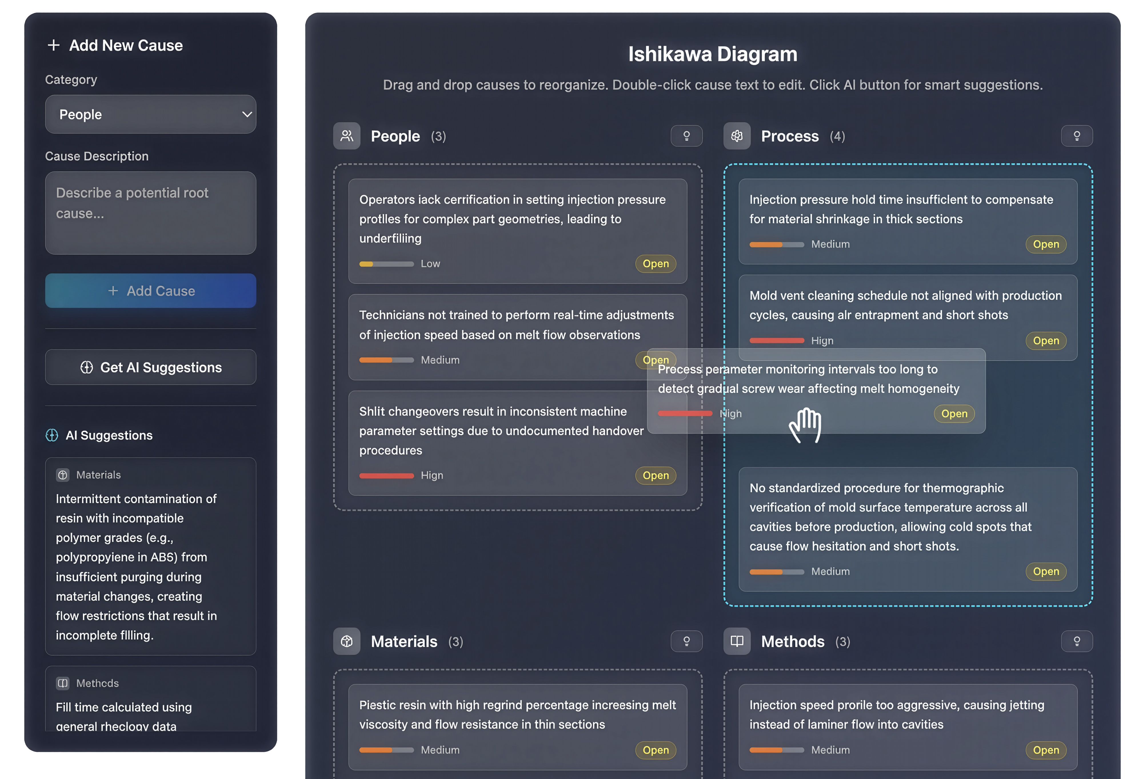
Guided problem definition walks you through a structured setup form before you start adding causes. You name the problem, add process context, select your department, set the priority level, define a timeline, and list stakeholders — all the information that makes the subsequent cause-hunting session productive rather than generic.
AI-powered cause suggestions are available per category. Click the AI button on any of the six bones and SIGMADESK generates targeted suggestions based on your problem description and process context — not boilerplate, but causes grounded in what you told it. You review them, select what applies, and add them with one click. You can also trigger a full pre-fill when creating the diagram, which populates all six categories at once as a starting point.
AI problem enhancement helps you sharpen vague problem statements before the session starts. If your description is rough, the tool rewrites it into a more precise, structured statement that produces better AI suggestions and clearer diagrams.
Drag-and-drop reorganization lets you move causes between categories when you realize something belongs elsewhere. Double-click any cause text to edit it inline — no modal, no interruption to the flow.
Cause Analysis tab gives you a structured table view of every cause across all six categories. Filter by category, impact rating, or investigation status. Update impact (Low / Medium / High) and status (Open / Under Investigation / Resolved) directly in the table — turning the diagram from a brainstorming tool into an actionable tracker.
Excel export packages the full diagram — problem statement, all causes organized by category, impact ratings, and statuses — into a formatted spreadsheet you can attach to a CAPA report, an 8D, or a DMAIC project folder.
And you will find more to explore in SIGMADESK as your root cause investigations develop.
More from SIGMADESK
-
Cp and Cpk: What’s the Difference? Explained
Process capability indices, Cp and Cpk, are two of the most commonly reported numbers in quality engineering. They’re calculated from the same underlying measurement data but they answer two different questions, and confusing them can lead to the wrong conclusion about whether a process is actually capable. This article focuses specifically on the distinction between Cp and Cpk, so if you need a fuller introduction and more comprehensive look to the process capability, that’s better you start with complete guide on Process Capability. Here, the goal is to make the difference between these two indices unambiguous. What Cp Measures Cp…
-
Population vs. Sample Standard Deviation: What’s the Difference?
A practical guide to standard deviation — what it measures, why it matters, and the difference between population and sample standard deviation explained with clear examples. Standard deviation is one of the most important concepts in statistics. It appears in manufacturing quality control, finance, healthcare, scientific research, and virtually any field where data needs to be understood. Yet despite its widespread use, the concept is often explained in ways that feel abstract or overly mathematical. This guide breaks it down step by step — what standard deviation actually measures, how to calculate it, and why there are two different versions…
-
SPC Control Charts for Variables (I-MR, Xbar-R, Xbar-S) Explained
A practical guide to control charts — from common vs. special cause variation to I-MR, X̄-R and X̄-S charts, control limit formulas, and when to use each one. Control charts are one of the core tools used in Six Sigma, quality management, and process improvement methodologies. They are especially common in engineering and manufacturing, but their usefulness is not limited to these fields. In fact, control charts can be applied anywhere data is collected over time. For example, you might use a control chart when you are: Although these examples come from different areas, they all have one important thing in…