SIGMADESK – Online Gage R&R Calculator
Built for Real MSA Work
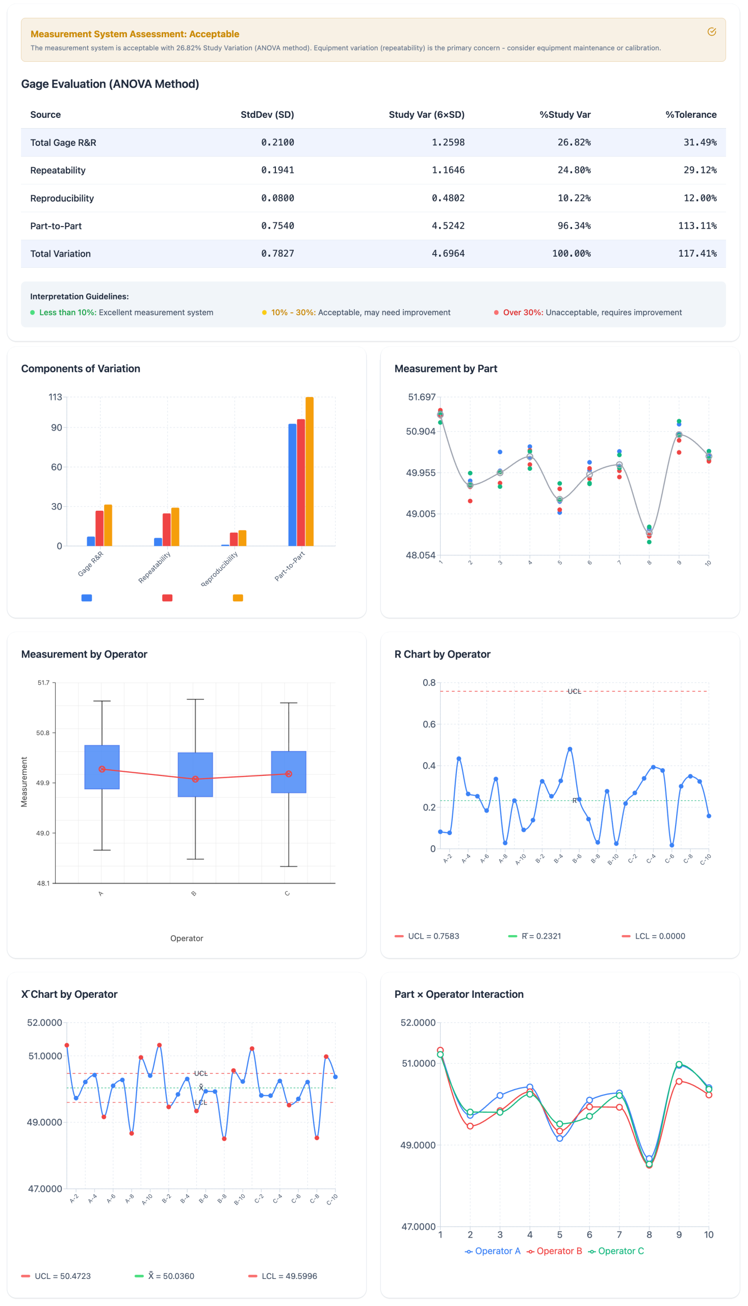
SIGMADESK is an online SPC software platform that lets you run, analyze, and interpret Gage R&R studies directly in your browser — no installation, no license fees. It covers the full Gage R&R workflow that quality practitioners actually use in the field, including ANOVA-based variance decomposition and six professional output charts.
Two entry paths for any situation:
- Create a Study Worksheet — configure your parts (2–10), operators (2–5), and replicates (2–5), then generate a pre-structured measurement sheet with randomized run order per operator. Fill in your measurements and proceed directly to analysis on the same page.
- Analyze Existing Data — paste data you already collected from Excel or any other source. Map your columns (Part, Operator, Measurement) and run the full analysis in seconds. SIGMADESK is flexible enough to accept any column structure.
Components of Variation — Gage R&R vs Part-to-Part breakdown
ANOVA-based calculations
Most spreadsheet-based Gage R&R templates use the Average and Range method because it is simpler to implement. SIGMADESK uses the ANOVA method, which is the industry standard in serious MSA work and the method used by Minitab. The ANOVA approach gives you a proper decomposition of variance into its sources — including the Part × Operator interaction — and provides F-statistics and p-values so you can assess statistical significance, not just percentages.
- Repeatability (Equipment Variation) — the within-appraiser variation when the same operator measures the same part multiple times. Estimated from the Error Mean Square of the ANOVA.
- Reproducibility (Operator Variation) — the variation introduced by different operators measuring the same part. Derived from the Operator Mean Square.
- Part × Operator Interaction — detects whether different operators are inconsistent across specific parts. When the interaction is not statistically significant, it is pooled into the error term for cleaner estimates.
- Part-to-Part Variation — the actual process spread you are trying to detect. A good measurement system needs this to dominate the variation budget.
Xbar Chart by Operator — most points should exceed the control limits for a capable measurement system
Six output charts that mirror Minitab's MSA report:
- Components of Variation chart — grouped bars showing % Contribution, % Study Var, and % Tolerance side by side for Gage R&R, Repeatability, Reproducibility, and Part-to-Part. The fastest way to see where your variation is coming from.
- Measurement by Part chart — all measurements plotted by part number, showing how well operators agree on each individual part and whether part-to-part spread is visible through the measurement noise.
- Measurement by Operator chart — box plot view per operator, useful for spotting systematic bias between appraisers.
- R Chart by Operator — range control chart per operator. Points outside the UCL indicate inconsistent technique from a specific appraiser — an equipment issue, a training issue, or both.
- Xbar Chart by Operator — averages by part for each operator overlaid on the same chart. In a capable measurement system, most part averages should fall outside the control limits, because the chart is designed to detect part-to-part spread, not measurement error.
- Part × Operator Interaction chart — multi-series line chart. Crossing lines indicate that different operators are ranking parts differently, which is a sign of interaction and a red flag for the measurement system.
A Gage R&R study is only as useful as the interpretation behind it. SIGMADESK is built with that in mind.
Gage Evaluation table gives you the complete picture at a glance. Standard deviation, Study Variation (6×SD), % Study Var, and % Tolerance are displayed for every variance component. Color-coded acceptability tells you immediately where you stand: green for less than 10% — excellent; yellow for 10–30% — acceptable but worth monitoring; red for above 30% — the measurement system needs work before you can trust the data.
Full ANOVA tables are included and expandable in the results view. You see the complete breakdown: Sum of Squares, Degrees of Freedom, Mean Squares, F-statistics, and p-values for Part, Operator, and Interaction effects — both with and without the interaction term. This is what you need to justify your conclusions to an auditor or a customer.
Tolerance analysis is optional but a single click away. Enter your upper and lower spec limits and the tool immediately adds % Tolerance columns to every table and chart. This is the number your customer wants to see.
Randomized run order is generated automatically when you create a worksheet. Each operator gets their own independent randomization, which is the correct approach for preventing systematic bias from part familiarity or order effects.
AI-powered interpretation is available directly in the results view. After your analysis runs, you can trigger a written narrative that explains what the numbers mean for your specific study — not generic boilerplate, but an assessment grounded in your actual variance components, ANOVA results, and operator behavior.
PDF export packages your complete study — configuration, all tables, all charts, and the full results — into a single document you can attach to a PPAP, a DMAIC project, or an internal audit report.
And there is more to explore in SIGMADESK as you work through your measurement system studies.
More on Statistical Process Control
-
Cp and Cpk: What’s the Difference? Explained
Process capability indices, Cp and Cpk, are two of the most commonly reported numbers in quality engineering. They’re calculated from the same underlying measurement data but they answer two different questions, and confusing them can lead to the wrong conclusion about whether a process is actually capable. This article focuses specifically on the distinction between Cp and Cpk, so if you need a fuller introduction and more comprehensive look to the process capability, that’s better you start with complete guide on Process Capability. Here, the goal is to make the difference between these two indices unambiguous. What Cp Measures Cp…
-
Population vs. Sample Standard Deviation: What’s the Difference?
A practical guide to standard deviation — what it measures, why it matters, and the difference between population and sample standard deviation explained with clear examples. Standard deviation is one of the most important concepts in statistics. It appears in manufacturing quality control, finance, healthcare, scientific research, and virtually any field where data needs to be understood. Yet despite its widespread use, the concept is often explained in ways that feel abstract or overly mathematical. This guide breaks it down step by step — what standard deviation actually measures, how to calculate it, and why there are two different versions…
-
SPC Control Charts for Variables (I-MR, Xbar-R, Xbar-S) Explained
A practical guide to control charts — from common vs. special cause variation to I-MR, X̄-R and X̄-S charts, control limit formulas, and when to use each one. Control charts are one of the core tools used in Six Sigma, quality management, and process improvement methodologies. They are especially common in engineering and manufacturing, but their usefulness is not limited to these fields. In fact, control charts can be applied anywhere data is collected over time. For example, you might use a control chart when you are: Although these examples come from different areas, they all have one important thing in…