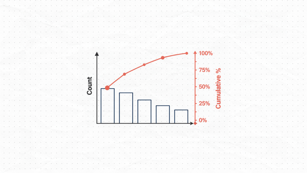
A Pareto chart is a combined bar and line chart that ranks categories from highest to lowest frequency or impact. The bars show individual category counts on a left vertical axis. The line shows the running cumulative percentage on a right vertical axis, moving from left to right across the categories.
Together, they make it visually obvious which few categories account for the majority of your problem — giving your team an immediate, data-driven basis for prioritization.
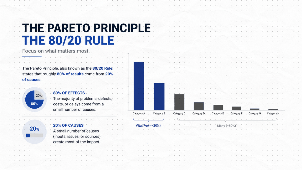
The chart is grounded in the Pareto principle, also known as the 80/20 rule: roughly 80 percent of defects, errors, or losses typically come from 20 percent of the causes. This is not a fixed mathematical law, but it holds consistently enough across industries and process types that it has become a foundational concept in quality management. The Pareto chart makes this pattern visible in your specific data.
How to Build a Pareto Chart: A Step-by-Step Example
Step 1: Collect Your Frequency Data
| Defect Type | Count |
|---|---|
| Flash | 22 |
| Short shot | 8 |
| Sink marks | 5 |
| Splay | 5 |
| Burn marks | 4 |
| Flow lines | 4 |
| Warping | 3 |
| Contamination | 2 |
| Weld line | 2 |
| Color streak | 2 |
| Total | 57 |
You need a count for each category you want to analyze. This could be defect types, failure modes, customer complaint categories, downtime causes, or any classification where you want to understand relative contribution.
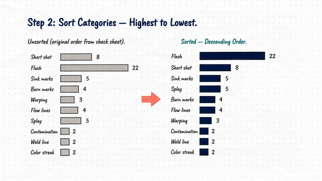
Step 2: Sort Categories in Descending Order
Arrange categories from highest count to lowest, left to right. If you have a miscellaneous or “other” category, place it at the far right regardless of its count. It is not a specific, actionable category and should not influence where the 80 percent threshold falls.
Our sorted order is: flash, short shot, sink marks, splay, burn marks, flow lines, warping, contamination, weld line, color streak.
Step 3: Calculate Cumulative Percentages
Divide each category count by the total, then accumulate percentages from left to right. Each bar’s cumulative percentage is the sum of all percentages up to and including that bar. The final bar always reaches 100 percent.
| Defect Type | Count | % of Total | Cumulative % |
|---|---|---|---|
| Flash | 22 | 38.6% | 38.6% |
| Short shot | 8 | 14.0% | 52.6% |
| Sink marks | 5 | 8.8% | 61.4% |
| Splay | 5 | 8.8% | 70.2% |
| Burn marks | 4 | 7.0% | 77.2% |
| Flow lines | 4 | 7.0% | 84.2% |
| Warping | 3 | 5.3% | 89.5% |
| Contamination | 2 | 3.5% | 93.0% |
| Weld line | 2 | 3.5% | 96.5% |
| Color streak | 2 | 3.5% | 100.0% |
Step 4: Draw the Chart
Plot the bars in descending order using the left vertical axis for counts. Then overlay the cumulative percentage line using a right vertical axis scaled from 0 to 100 percent. The line originates at the top right corner of the first bar and ends at 100 percent above the last bar.
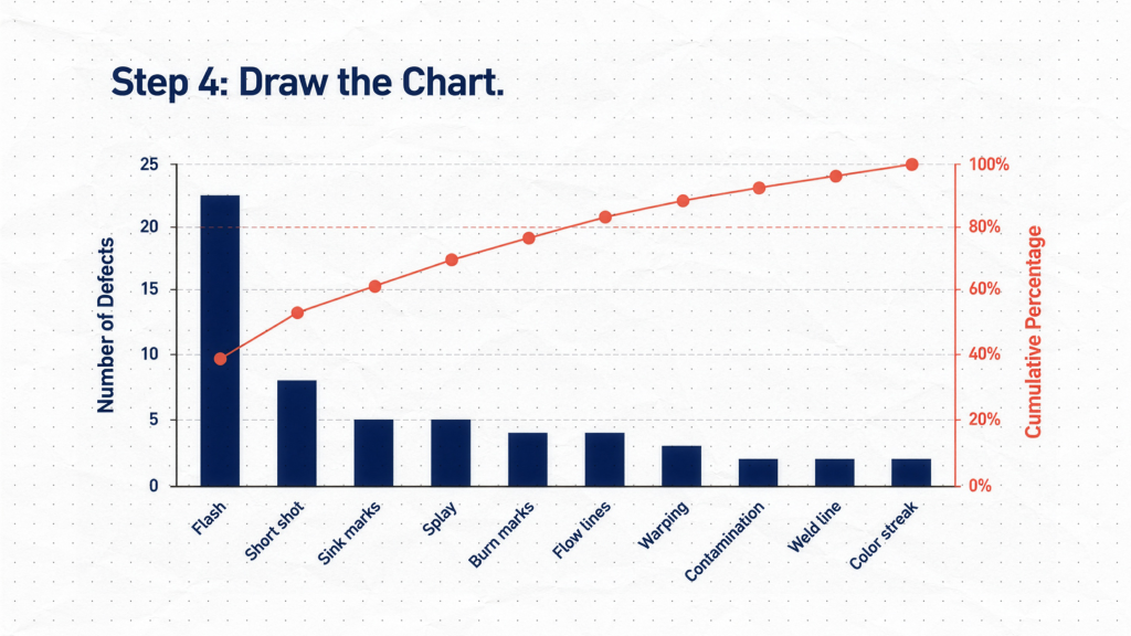
In our chart, the cumulative line crosses 80 percent after flow lines, with a running total of 84.2 percent. This means six defect types — flash, short shot, sink marks, splay, burn marks, and flow lines — together account for 84.2 percent of all defects on Line 3 that week. The remaining four defect types combined account for less than 16 percent.
That tells your team exactly where to direct attention first.
Practical Considerations
Pareto charts reveal what, not why. They show which categories occur most often, not what is causing them. Once you have identified your vital few, the next step is root cause analysis. The cause-and-effect diagram — covered in Part 4 of this series — is the tool designed for that investigation.
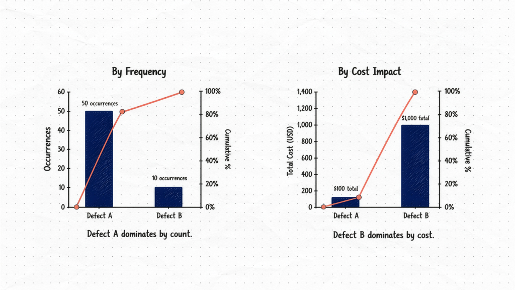
Consider weighting by impact, not just frequency. If defect type A occurs 50 times at a repair cost of $2 each, and defect type B occurs 10 times at a repair cost of $100 each, the cost-weighted Pareto will look very different from the frequency-based one. Use whichever measure best reflects the actual business impact in your process. Common impact measures include cost, downtime hours, warranty claims, and customer complaint severity.
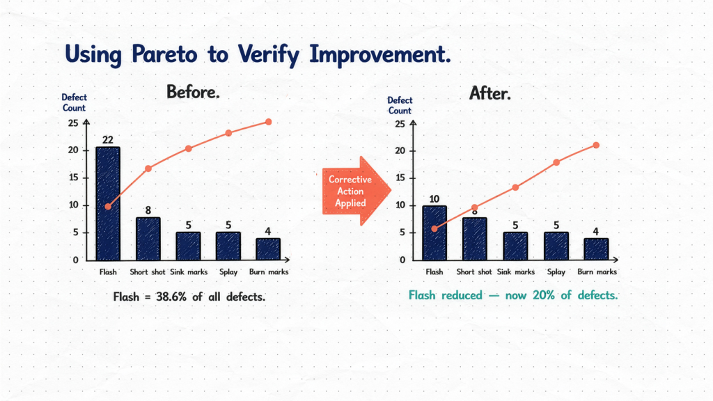
Use Pareto charts to verify improvement. Run a chart before a corrective action and another after, under the same time period and measurement conditions. If your vital few categories have shifted or reduced in proportion, you have data-backed evidence that the improvement worked.