The tool that feeds the histogram — and every other quality tool — at its source. The check sheet is often the very first step in any quality investigation, and for good reason: it is where good data collection truly begins.
What Is a Check Sheet?
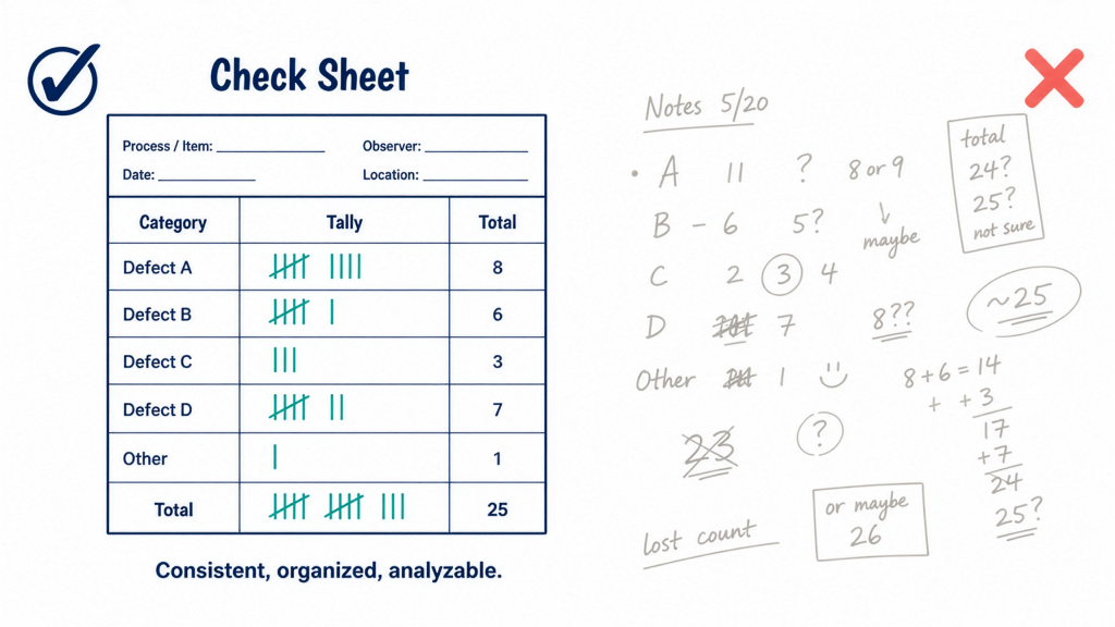
A check sheet is a structured form used to collect and record data in real time, at the location where the data is actually generated. It makes data collection consistent, organized, and easy to analyze.
Rather than relying on scattered notes or end-of-shift memory recall, a check sheet gives every operator the same form, designed around the specific question you are trying to answer. The result is reliable, comparable data that everyone records in exactly the same way — regardless of which shift, line, or operator produces it.
The Check Sheet as a Gateway Tool
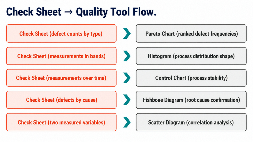
What makes the check sheet particularly powerful is not what it tells you by itself, but what it enables downstream. The way you structure it determines which analytical tool it feeds next.
- Pareto chart — Count defects by type, and the totals rank your problems from most to least frequent.
- Histogram — Record measurements into predefined bands, and the tallies form a frequency distribution.
- Control chart — Log measurements over time, and the data tracks process stability.
- Fishbone diagram — Sort defects by suspected cause, and the data supports root cause analysis.
- Scatter diagram — Capture two measured variables together, and the pairs reveal correlation.
In every case, the check sheet is the front end. The quality of everything downstream depends on getting the data collection step right.
A Worked Example: Injection Molding Defect Sheet
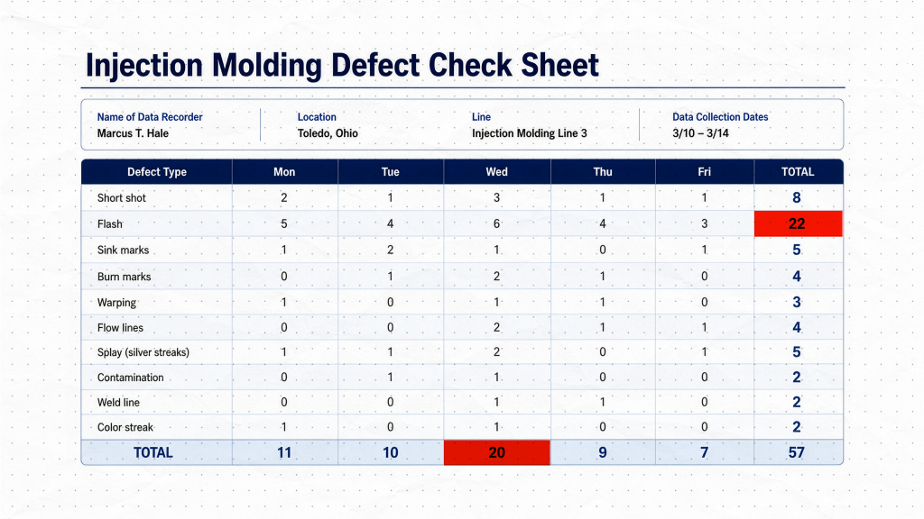
To make this concrete, consider a completed defect check sheet from a plastic injection molding line recorded over one week.
The header identifies who recorded the data, where it was collected, and the date range. This is what makes the data traceable. When a pattern appears, you need to know exactly which line and which week it came from. A check sheet without this context is just a pile of numbers.
The left column lists defect types — short shot, flash, sink marks, burn marks, and so on — defined before any data was collected. Because every operator works from the same categories, a given defect always lands in the same row.
The column headers break the week into days, Monday through Friday. This adds a time dimension, so you can see not only what went wrong, but when.
Inside the grid, every tally mark represents a single occurrence recorded at the moment it happened, not reconstructed from memory at end of shift.
Reading the totals reveals the real value of the completed sheet. The right-hand column sums each defect type across the week — and flash stands out immediately at 22 occurrences, far more than any other defect. The bottom row sums each day, and Wednesday stands out as the worst single day with 20 total defects, a clue worth investigating on its own.
Without any further analysis, the completed sheet has already ranked the defects and flagged the worst day. Those weekly totals drop directly into a Pareto chart — which is exactly the tool we cover in Part 3.
How to Build a Check Sheet
Follow this four-step method to design an effective check sheet from scratch.
1. Define the question precisely. Are you looking for the most common defect type, where defects appear on the product, or how often a process step is skipped? The clearer the question, the more purposeful the form design.
2. Choose clear, mutually exclusive categories. An operator should never hesitate about where a mark belongs. Ambiguity in category definitions produces inconsistent data — and inconsistent data is the enemy of reliable analysis.
3. Design the form with context in mind. Include a header section for operator name, line, date, and any other traceability information relevant to your process. Keep the grid clean and simple.
4. Pilot before full rollout. Test the form with a few operators before deploying it across shifts. A form that is awkward to use gets filled in carelessly, and careless data is worse than no data at all.
Best Practices
- Keep it simple. Every extra column adds friction at the point of data collection.
- Collect at the source. Record data where and when events happen, not from memory at end of shift.
- Train consistently. Every person who uses the form should understand what each category means, so a single tally mark means the same thing on every shift.
- Review regularly. A check sheet that is filled in and never examined serves no purpose. Build a review cadence into the process.