Statistical Process Control offers a powerful set of tools for monitoring and improving process performance — but only if you start with the right chart. Use the wrong one and you risk missing real process shifts, reacting to noise, or drawing conclusions from data that the chart was never designed to handle.
The good news is that selecting the correct control chart comes down to answering a small number of straightforward questions about your data. This guide walks you through that decision process step by step.
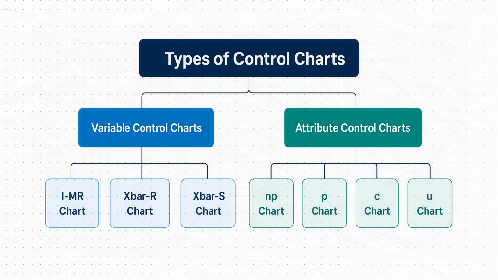
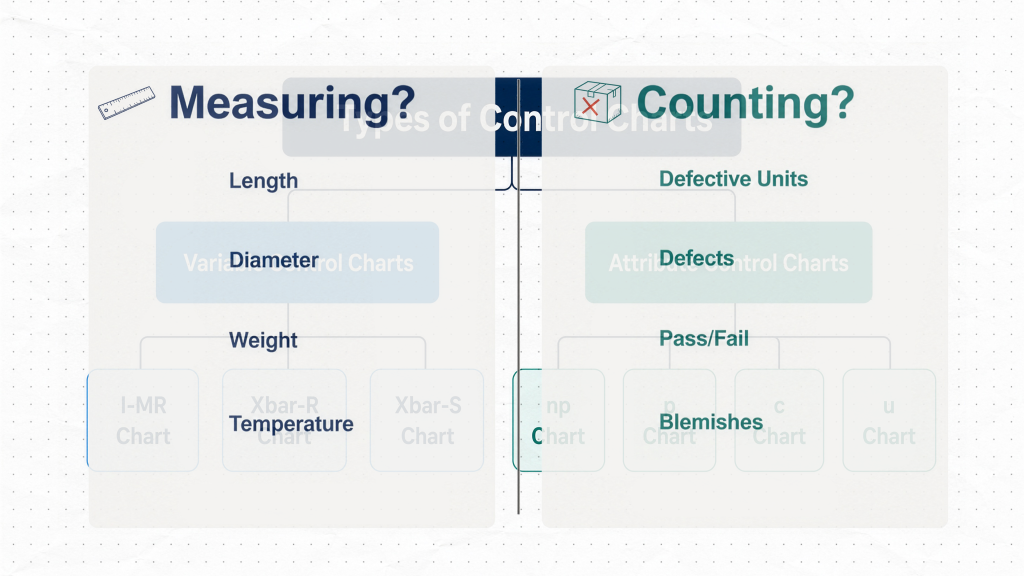
Step 1: Are You Measuring or Counting?
This is the most important question, and it immediately splits the field in two.
Variable data arises when you measure something — length, diameter, weight, temperature, cycle time. The result can take any value within a continuous range. If your process produces a number on a scale, you are working with variable data.
Attribute data arises when you count something — defective products, scratches on a surface, missing labels, pass/fail inspection results. There is no measurement involved. You are simply asking “how many?” rather than “how much?”
Once you have answered this question, you have already eliminated half the available charts.
Choosing a Chart for Variable Data
When your data is variable, the next question is about how you collect it. Are You Measuring One at a Time, or in Groups?
Individual measurements — use the I-MR Chart
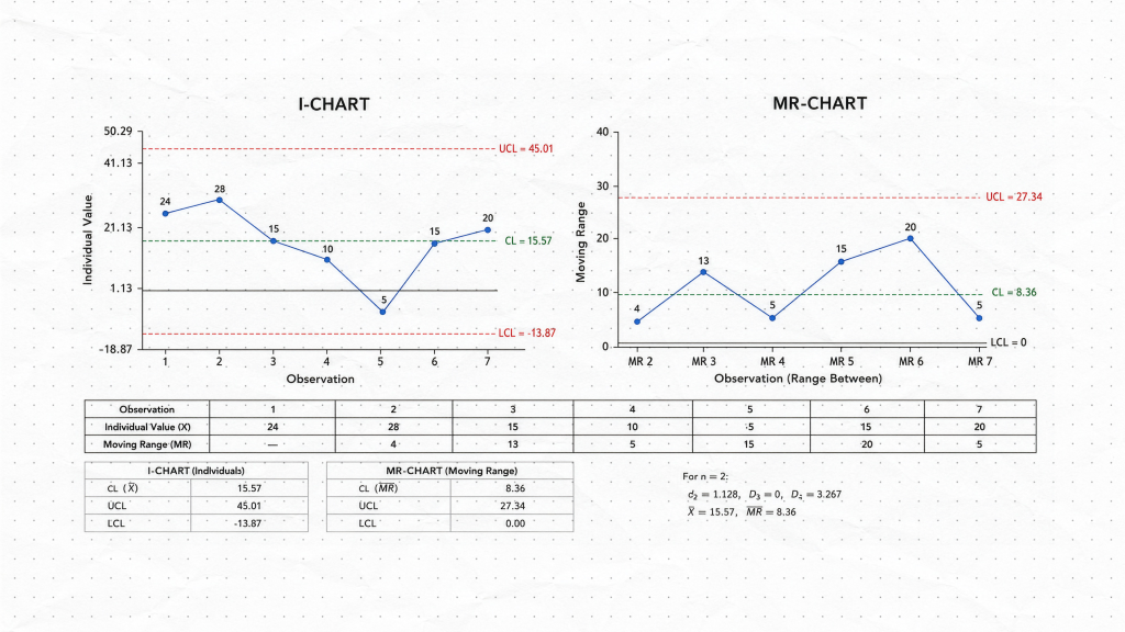
If you collect one measurement at a time — one temperature reading per hour, one cycle time per shift, one result per production batch — the I-MR chart is almost always the right choice. The “I” stands for Individuals, and the “MR” stands for Moving Range, which estimates process variation using consecutive pairs of data points.
The I-MR chart is particularly well suited to:
- Low-volume production where you measure every part
- Processes where measurements are infrequent by nature
- Short-term investigations where you want to see every individual value without averaging
Because each data point is plotted directly, the I-MR chart makes it easy to spot unusual values and sudden process shifts. The trade-off is that individual measurements carry more noise than averages, so subtle shifts may be harder to detect in high-volume, long-term monitoring.
Grouped measurements — use a Subgroup Chart
If you can collect several measurements under similar conditions, subgrouping is a better approach. A subgroup might be five parts measured every hour, or ten units sampled from each production run. Grouping separates short-term, within-subgroup variation from the larger, between-subgroup changes you actually want to detect. Because subgroup averages are less noisy than individual measurements, these charts are generally more sensitive to meaningful process shifts.
The choice between the two subgroup charts depends on how many observations are in each group.
Subgroup size 2–10 — use the X̄-R Chart
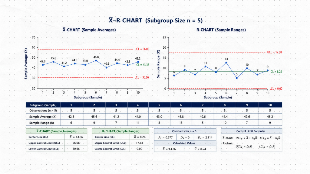
For smaller subgroups, the X̄-R chart (read: “X-bar R chart”) is the standard choice. The X̄ chart tracks the subgroup average, revealing shifts in the process center. The R chart tracks the subgroup range — the difference between the highest and lowest value in the group — which reflects process variation. Together, the two charts provide a complete picture of process behavior.
Range works well for small groups because the maximum and minimum values adequately capture the spread of the data. Common examples include measuring five parts per hour or inspecting four bottles from each production run.
Subgroup size greater than 10 — use the X̄-S Chart
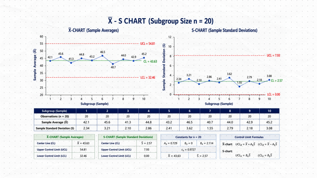
For larger subgroups, the range becomes a less reliable measure of variation because it considers only two values and ignores everything in between. The X̄-S chart replaces the R chart with an S chart that tracks the subgroup standard deviation, giving a more accurate and statistically efficient estimate of spread. The X̄ portion works identically to the X̄-R chart — you are still monitoring the subgroup average alongside the variation.
Choosing a Chart for Attribute Data
When your data is attribute data based on counting, the next question distinguishes between two different types of counts. Are You Counting Defective Units or Counting Defects?
This distinction is easy to overlook, but it is critical for chart selection.
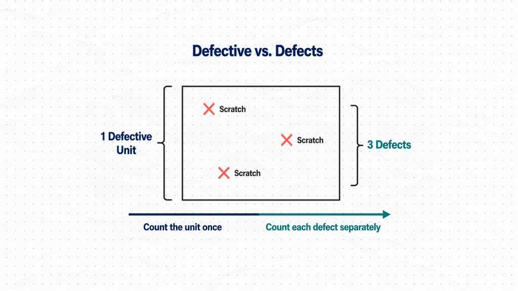
Defective units are individual items that have failed. A product either is defective or it is not. You count the number of units that did not pass — regardless of how many problems each unit has.
Defects are individual nonconformances. A single unit can contain multiple defects. A painted panel with three scratches is one defective unit but three defects.
To make this concrete: imagine inspecting a batch of painted panels. Counting how many panels have at least one scratch gives you a count of defective units. Counting the total number of individual scratches across all panels gives you a count of defects. One panel, three scratches — same product, two entirely different numbers.
Counting Defective Units
If you are counting units that failed — products that fail inspection, incorrectly assembled items, parts that contain at least one defect — the final question is whether your sample size stays constant.
Constant sample size — use the NP Chart
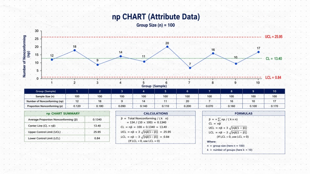
If you inspect exactly 100 units every day, the NP chart is the most straightforward option. It plots the actual number of defective units directly, with no conversion required. The chart is simple to interpret and easy to explain to operators and stakeholders.
Variable sample size — use the P Chart
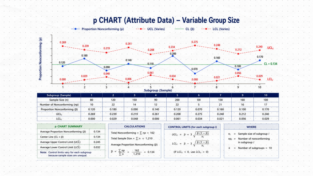
If your sample size changes from day to day — 100 units on Monday, 150 on Tuesday, 120 on Wednesday — the NP chart can no longer be used directly, because the control limits would need to change with every sample. The P chart solves this by converting the count into a proportion: the number of defective units divided by the sample size. This makes results comparable across samples of different sizes, and the chart adjusts its control limits accordingly.
Counting Defects
If you are counting individual nonconformances — scratches, paint blemishes, soldering defects, data entry errors — the final question is whether the inspection opportunity stays the same.
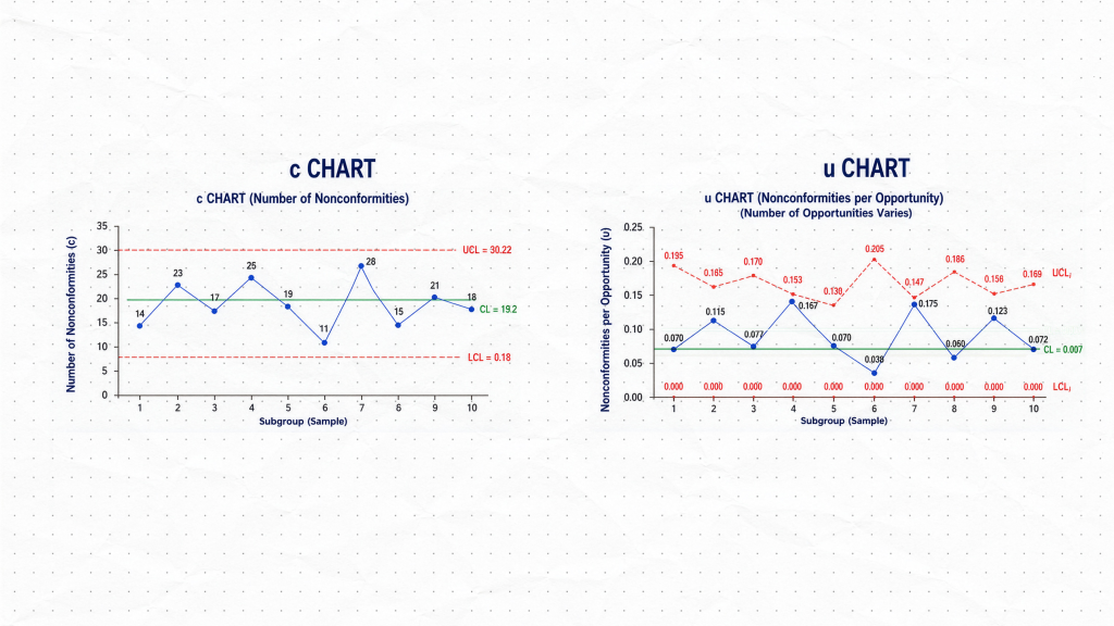
Constant inspection opportunity — use the C Chart
If you always inspect the same area, the same product type, or the same quantity of material, a C chart is appropriate. It plots the total number of defects per inspection unit directly. The assumption is that every inspection unit represents an equal opportunity for defects to occur.
Variable inspection opportunity — use the U Chart
If batch sizes vary, different numbers of products are inspected each period, or the inspected surface area changes, the C chart is no longer appropriate — larger inspection units will naturally produce more defects simply because there is more area to find them. The U chart accounts for this by calculating defects per unit, normalizing the count against the size of the inspection opportunity. This makes the results comparable even when what you are inspecting is not always the same size.
Summary: The Control Chart Selection Framework
| Data Type | Subgroup / Sample | Key Question | Chart |
|---|---|---|---|
| Variable | Individual measurements | — | I-MR |
| Variable | 2–10 per subgroup | — | X̄-R |
| Variable | More than 10 per subgroup | — | X̄-S |
| Attribute (defective units) | Constant sample size | — | NP |
| Attribute (defective units) | Variable sample size | — | P |
| Attribute (defects) | Constant opportunity | — | C |
| Attribute (defects) | Variable opportunity | — | U |
Putting It Into Practice
The framework above will guide you to the correct chart in almost every situation. Before finalizing your choice, it is worth confirming a few practical points:
- For I-MR charts: Check that consecutive measurements are reasonably independent. If measurements are highly autocorrelated (each one strongly predicts the next), standard control limits may not perform as expected.
- For subgroup charts: Ensure measurements within each subgroup were taken under similar conditions. The whole point of subgrouping is to isolate within-subgroup variation as a baseline.
- For P and U charts: Expect the control limits to vary between samples. This is normal behavior when sample sizes differ, not an error.
- For NP and C charts: Verify that your sample size or inspection opportunity is truly constant before using these over their variable-sample counterparts.