How to Create an I-MR Control Chart Online - Beginner's Guide
A hands-on walkthrough of creating and interpreting an I-MR (Individuals and Moving Range) Control Chart using SIGMADESK — perfect for anyone new to SPC or looking for a quick refresher.
In this guide, we'll walk through how to create and interpret an I-MR (Individuals and Moving Range) Control Chart using SIGMADESK. Whether you're new to SPC or looking for a quick refresher, this hands-on example will help you understand the fundamentals in a practical way. If you'd first like a broader overview of all control chart types, see our SPC Control Charts — Complete Guide.
What Is an I-MR Control Chart?
An I-MR Control Chart actually consists of two charts used together:
- I-Chart (Individuals Chart): Displays individual measurements over time.
- MR-Chart (Moving Range Chart): Displays the variation between consecutive measurements.
These charts are especially useful when data is collected one observation at a time instead of in subgroups.
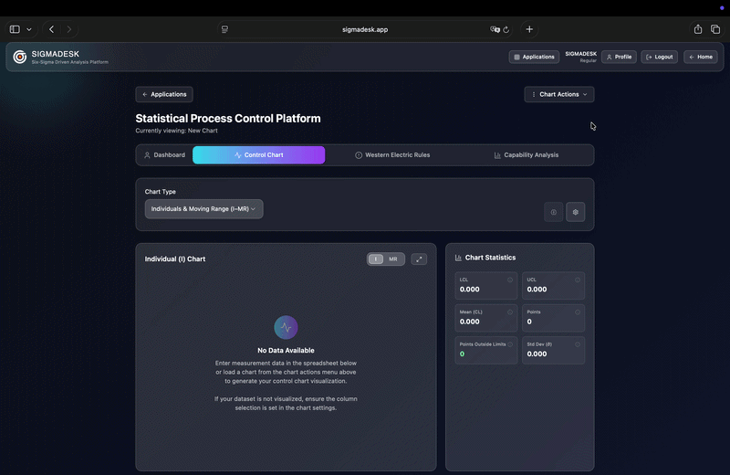
Step 1: Open the Control Chart Generator
To begin, go to SIGMADESK and open the Control Chart Generator from the homepage or from the applications page.
This takes you directly to the I-MR Chart Creator, where you can either:
- Copy and paste your dataset into the spreadsheet below
- Or load a previously saved control chart
For this example, we'll load a sample chart prepared earlier through the Chart Options section.
Once the dataset is loaded, the I-Chart is automatically visualized.
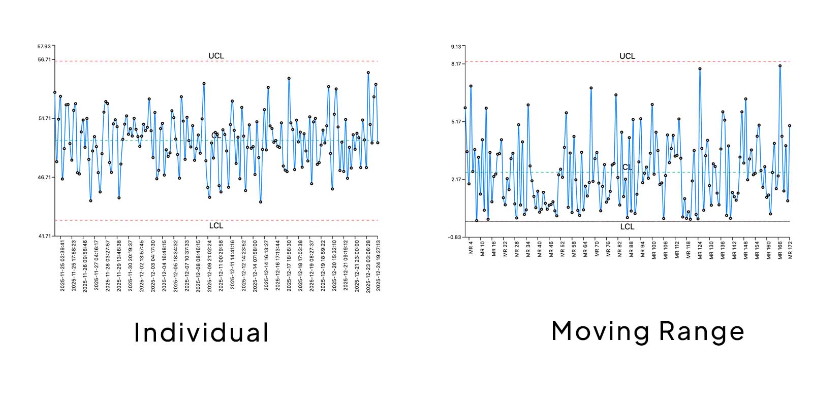
Understanding the Basics of an I-Chart
Before interpreting the results, it's important to understand the structure of the chart.
Axes and Data Points
An I-Chart contains:
- Y-Axis: Represents the measurement values
- X-Axis: Represents labels such as dates, batch numbers, or custom identifiers
If no labels are provided, SIGMADESK automatically uses the sequence order of the measurements.
Each data point is connected in sequence, making it easier to identify:
- Trends
- Sudden shifts
- Patterns
- Variation over time
Key Components of an I-Chart
Center Line (CL)
The Center Line is simply the average of all measurements in the dataset. It represents the expected process average.
Upper and Lower Control Limits (UCL & LCL)
The control limits are calculated using estimated process variation and are placed at:
- +3 standard deviations
- −3 standard deviations
from the process average. These limits define the expected range of natural process variation.
Why Are Control Limits Important and Why ±3 Standard Deviations?
In a normal distribution, approximately 99.73% of measurements are expected to fall within ±3 sigma.
So when a data point falls outside the control limits, it may indicate the presence of a special cause variation rather than normal process fluctuation.
This is where control charts become powerful:
They help teams quickly identify unusual behavior and strengthen root cause analysis efforts.
Inside the chart interface, you can also view:
- Total number of data points
- Number of violations outside control limits
- Estimated process standard deviation
The I-Chart focuses entirely on individual measurements and visualizes how those observations behave over time.
What Is the MR Chart?
The Moving Range (MR) Chart complements the I-Chart by focusing on variation between consecutive data points.
Instead of plotting the actual measurements, the MR Chart plots the absolute difference between one measurement and the next.
For example:
If two consecutive measurements show a sudden jump, that spike becomes highly visible in the MR Chart — even though the points may still be within limits on the I-Chart.
This makes abnormal moving range variation easier to detect.
Reading the MR Chart
When switching to the MR view, you'll see:
- A Moving Range center line
- Control limits specifically calculated for moving ranges
- Average moving range
- Standard deviation
The MR Chart is particularly effective at revealing short-term instability that may not be obvious on the Individuals Chart alone.
Additional Statistical Features in SIGMADESK
Beyond standard control chart analysis, SIGMADESK also includes advanced quality tools such as:
Process Capability Analysis
You can define specification limits in settings and instantly calculate:
- Cp
- Cpk
These metrics help evaluate whether your process is capable of consistently meeting customer requirements. For a deep dive into what these numbers mean, see our dedicated article on Process Capability Analysis (Cp, Cpk, Pp, Ppk).
Western Electric Rules
SIGMADESK can also automatically detect Western Electric Rule violations (Rule 1–4), which are used to identify non-random patterns in process behavior. These rules help detect pattern issues beyond simple out-of-limit points.
Final Thoughts
I-MR Control Charts are one of the simplest yet most effective SPC tools for monitoring process stability.
By combining:
- Individual measurement tracking
- Variation analysis
- Statistical control limits
they provide a powerful foundation for identifying process problems before they become major issues.
If you'd like to practice creating your own charts, you can explore the tool directly on SIGMADESK and experiment with your own datasets.
Understanding control charts is a valuable skill for anyone working in:
- Quality engineering
- Manufacturing
- Process improvement
- Lean Six Sigma
- Data analysis
And once you master I-MR Charts, you'll have a much stronger foundation for process control and continuous improvement — and be ready to tackle subgroup-based charts like the Xbar-R Chart.
Ready to build your first control chart?
Try SIGMADESK for free